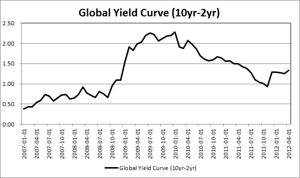
The global yield curve reveals why the 2008 recession was so bad, why the 2009 recovery was so pronounced and the outlook for 2012 and beyond. Aggregating individual country yield curves reveals a more complete picture of the true state of the global economy than looking at individual yield curves alone. We previously looked at the U.S. Yield curve, Japanese yield curve and the Chinese yield curve. But, it struck me that we hadn’t put all the information together in the form of a global yield curve. With economies so interdependent these days, there is extra information to be gleaned through aggregation.
The reason why I look at yield curves is explained here. I don’t intend to write a full exposition now, but suffice to say that the shape of the curve provides us with valuable information about the economic cycle. Specifically, the position of the short-term rate relative to the long-term rate reveals how tight or loose monetary policy is.
A very steep curve, where the long-term rate is significantly above the short-term rate, reveals that policy is loose. Further economic expansion is likely, along with inflationary pressures later-on. The curve typically becomes flatter when the authorities raise the short-term rate in line with the long-term rate. This is usually because their CPI measure has increased and so they raise the short-term rate in response, signalling tighter policy.
I constructed this curve with data from the four largest economies: United States, Eurozone, China, and Japan. As the United States and Eurozone are similar in size, I gave them an equal weighting of 35 per cent. China and Japan received a weighting of 15 per cent each. I used the 10 year – 2 year spread to calculate the slope in each instance.
Global Yield Curve: GDP Weighting

The first point to note is the steepness of the curve since loosening policies commenced in 2008. A longer term study would reveal that current monetary policy is extremely loose by historical standards. However, this steepness is not quite as pronounced in the global yield curve as in the U.S. yield curve. Since early 2010, the curve has started to flatten a little.
I also think it’s worth noting that this curve flattened out before the crisis in 2008. This represents early tightening in the US and to a lesser degree the Eurozone. It also hasn’t really flattened out that much in recent times, despite the sell-off in commodity prices. It hasn’t escaped my attention that the Chinese yield curve seems to have more explanatory power for markets and especially commodity prices. It may be worthwhile re-weighting the curve by contribution to world growth instead of economic size, in order to give a heavier weighting to China.
Global Yield Curve: Growth Weighting

In this curve I have given a 50 per cent weighting to China and 25 percent to the United States and the Eurozone, reflecting their lower contribution to global growth. Japan has been omitted altogether.
This curve flattens out later than the earlier one, steepens slightly later and then flattens out more aggressively over the last two years. Note that the flattening in 2011 was not sufficient to bring about a global collapse because the United States and the Eurozone did not join in the tightening, unlike in 2008. Notice that the curve has started to steepen again this year, following looser policy from the Chinese. I expect this trend to continue.
This curve looks like it has more explanatory power, particularly when thinking about commodity prices. The most useful curve of all would probably be a BRIC yield curve that could more fully capture demand in the commodity markets. I will endeavour to do this in the future.
Conclusion
The yield curve continues to have the most ordinary explanatory power. It really does add value. When thinking about commodity prices it may be more useful to look at the yield curves of the emerging markets, whose growth is fuelling the demand for this sector.
In terms of the hard landing theories swirling around, it’s important to know that we are not in a period of global tightening like 2007/2008. Many of the emerging markets did flatten their yield curves last year, but the EU and United States didn’t. It was not a co-ordinated tightening.
The BRIC countries have started loosening again. When you combine this with the continuation of loose policies in the developed countries, we can expect an improvement in economic conditions this year and into next year.
The party will end when all countries are simultaneously forced to tighten due to inflationary pressure and the global yield curve is flattened.